Freddie Mac
Redesigning the Single-Family website to serve the people who keep the housing market moving.

Summary
This project set out to better understand and improve our customers' experience by redesigning our website to fit their needs.
The Site
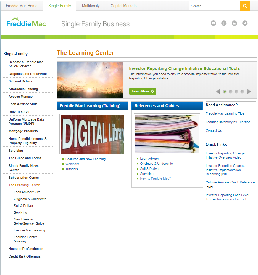
The Freddie Mac Single-Family website serves as a “base-camp” for everything customers need to know — from thought leadership and market insights, to origination and servicing tools, products, and guidelines. All in an effort to be better partners to customers as they help borrowers achieve the goal of homeownership.
The Challenge
The website hadn't been designed with the user's experience in mind. 50% of the call center's volume could be attributed to users getting “stuck” somewhere as they tried to accomplish tasks on the site.
Discovery
Internal stakeholders had assumptions about how to improve the site, supported by anecdotal evidence from the customer care center and sales team. But assumptions aren't enough — so we interviewed roughly 32 customers, internal and external, to validate. Here's what we heard:
Customers Wanted Intelligence & Expertise
Products are supported by insightful teams and deepen brand value — but were hard to find. Every visit took 4–5 clicks to reach what users were looking for.
Site Taxonomy Was Not Intuitive
The primary site navigation was not built around primary user groups and their actual needs.
Lack of Clear Paths for Users
The site didn't have clear entry points or experiences relevant to primary user groups.
The Plan
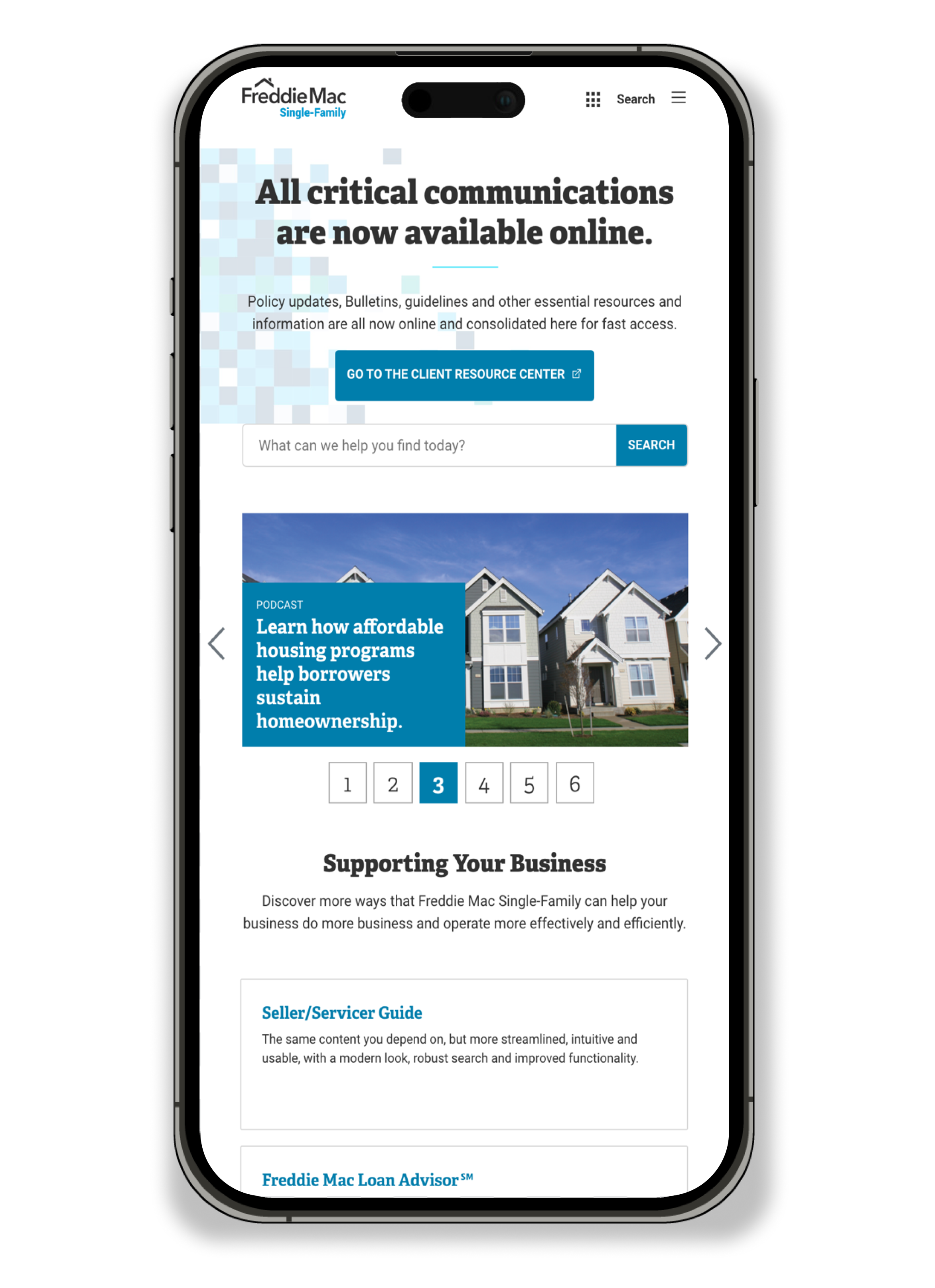
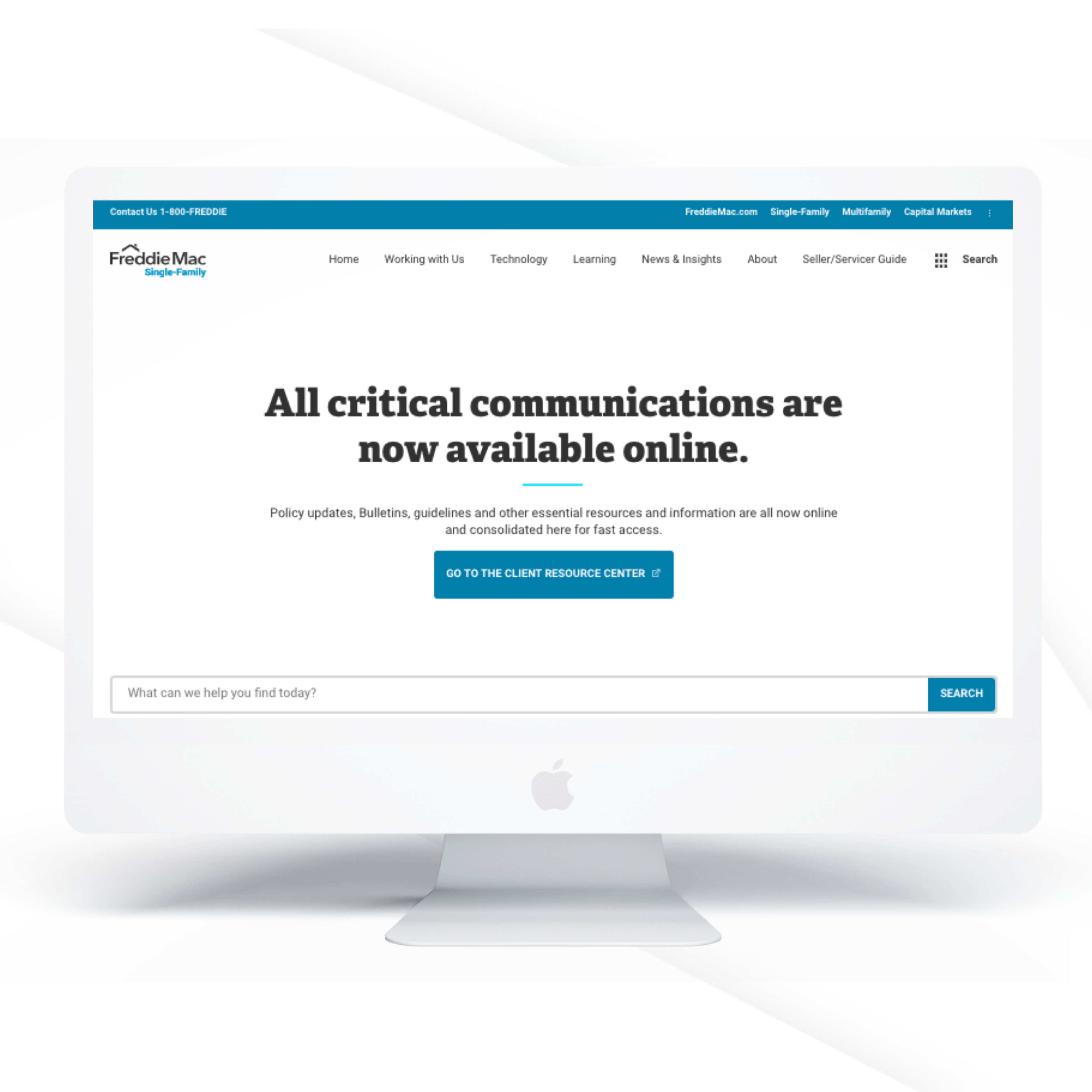
After gaining a better understanding of user needs, we set out to create a completely new experience — enhancing everything from site architecture down to branding elements and bringing the Freddie Mac voice into the modern era.
New Site Architecture
Decreased the difficulty of getting users to the content they need.
Smarter Search
Context-sensitive, type-ahead, suggested terms, and faceted search.
Consistently Connected Content
Related content surfaced throughout the experience.
Stronger Branding
Modern visual identity with additional white space for readability.
The Redesign
Conclusion
Though we improved UX in many ways, customer satisfaction scores began to drop after implementation. We expected a brief dip as clients adjusted — but after four straight months of falling scores, we knew something had to be done.
Data from site surveys and Hotjar revealed two issues:
Users were confused — because of the old site structure, clients expected to find guide content on the SF site, but the guide was now a separate site entirely.
Users were having trouble finding content they had bookmarked — content they returned to time and time again.
Knowing that search was users' main navigation method, we made two targeted improvements:
Guide Redirect
If a query related to the guide in any way, search would provide a direct route through.
Featured Results
Search was updated to display the most popular pages relating to a query at the top of results.
~30 points
Customer satisfaction score increase after improvements
“Thank you for reading my case study!”
Want to work with me? Feel free to contact me, or say hello on LinkedIn.